The name Fourhalf suddenly came to mind when the founder of Fourhalf opened his first business which was engaged in shoe washing services, “Empat Setengah” in Indonesian which means “four and a half”, inspired by the founder’s physical condition. who had experienced a driving accident which caused half of the little finger on his left hand to be amputated, which resulted in only four and a half fingers remaining on his left hand.
This name is also described as symbolizing imperfection where, for Fourhalf, imperfection is what it is necessary to express courage and understanding within oneself, and that is poured into every aspect of the company, where every goal, product or service produced must provide meaning, namely “even though it is not perfect, we dare to exist, and we try to understand what is you want and need as we understand ourselves” a concept that is integrated with the main slogan of this brand, namely “we’ll do yours as we’ll do ours”

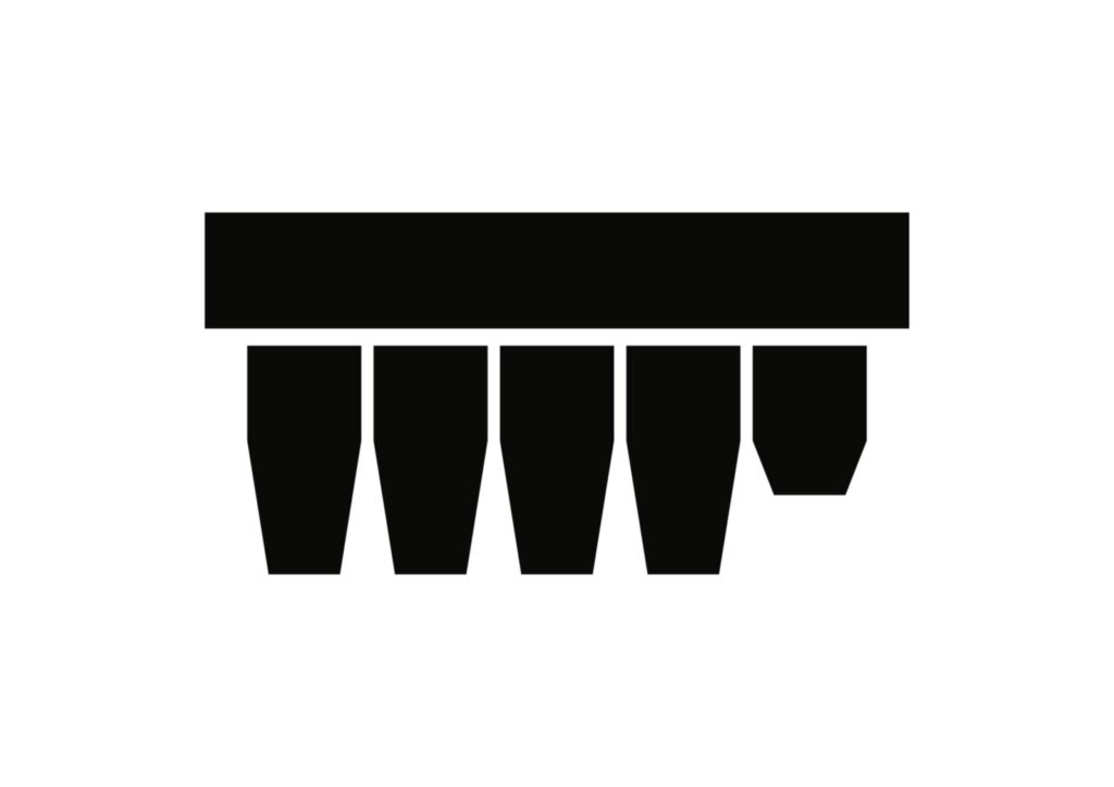
Fourhalf Brush Logo
The brush-shaped logo with imperfect bristles was the original logo of Fourhalf. The brush was chosen as the inspiration for the logo because Fourhalf’s first service was shoe cleaning, and cleaning shoes is closely associated with the use of a bristle brush.
The imperfect bristles represent the character and philosophy of the Fourhalf brand: imperfection can create something meaningful, useful, and productive. It reflects the belief that something does not have to be perfect to have value or to create a positive outcome.

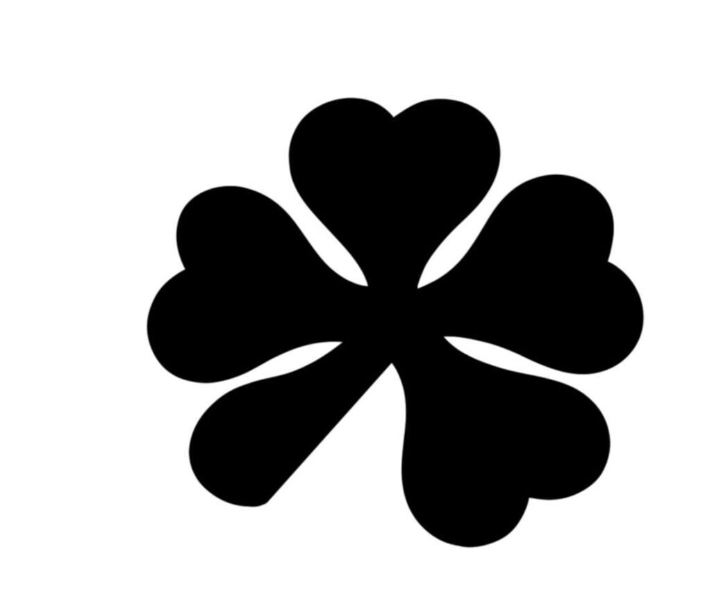
Fourhalf Clover Logo
Have you ever heard of the “four-leaf clover”? It is widely recognized as a symbol of good luck.
This logo was inspired by that idea. But why did we add a half leaf to the logo? There is no particular reason—we simply thought that luck is often seen as something perfect, and we wanted to show its imperfect side.
We believe that luck comes from an imperfect journey that never stops. It is not about everything being perfect; it is about continuing to move forward, even when the journey is incomplete or uncertain.
We use this logo for products within our clothing and accessories line.
We chose to use our brand name itself as the logo—to make it recognizable, to catch people’s attention, and to spark curiosity.
We chose a bold, strong, and simple typeface so it would be easy for you to remember, easy for you to recognize, and able to exist anywhere, in any place.
It represents who we are and what we stand for.
We are you, and you are us.
Showreel